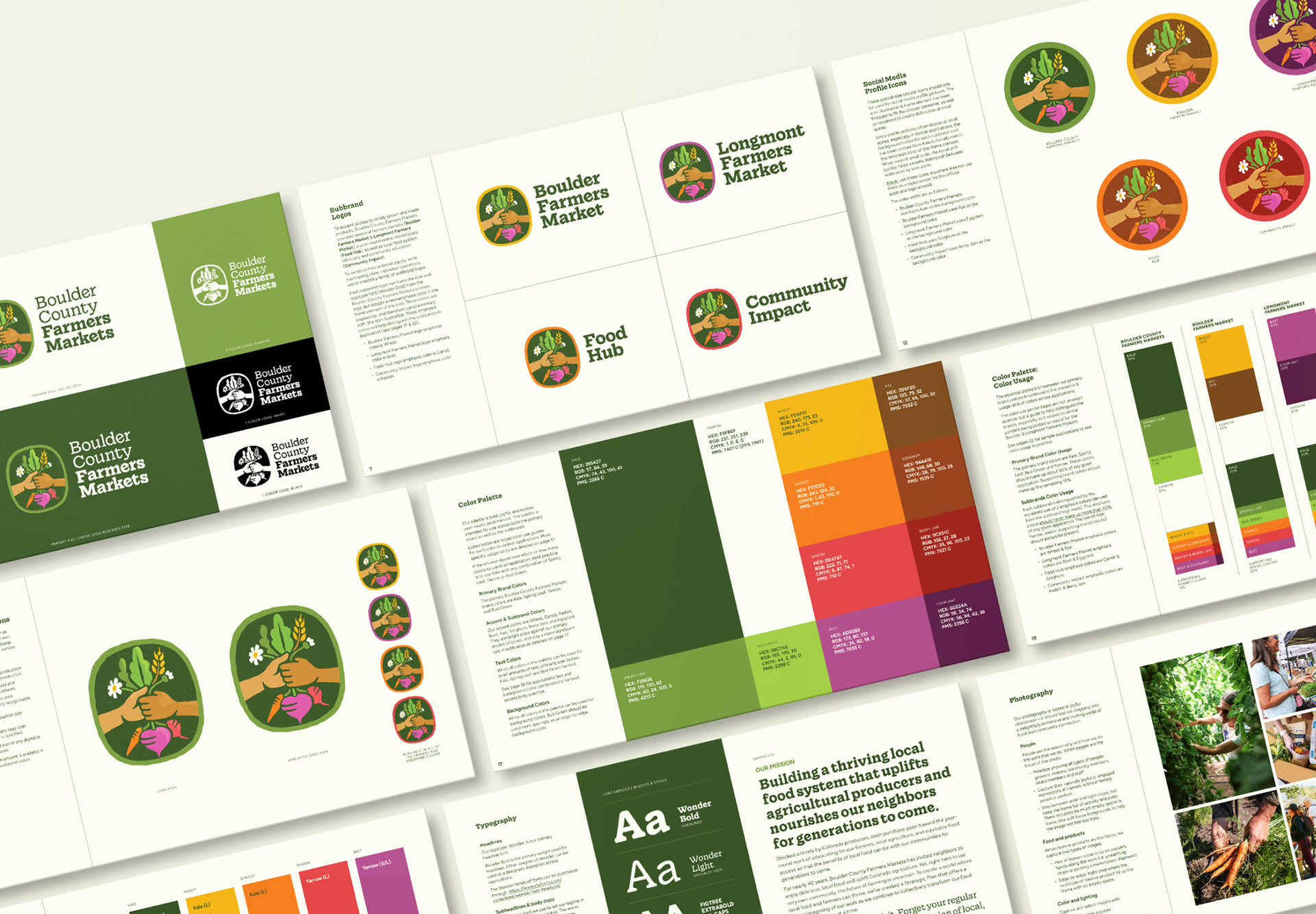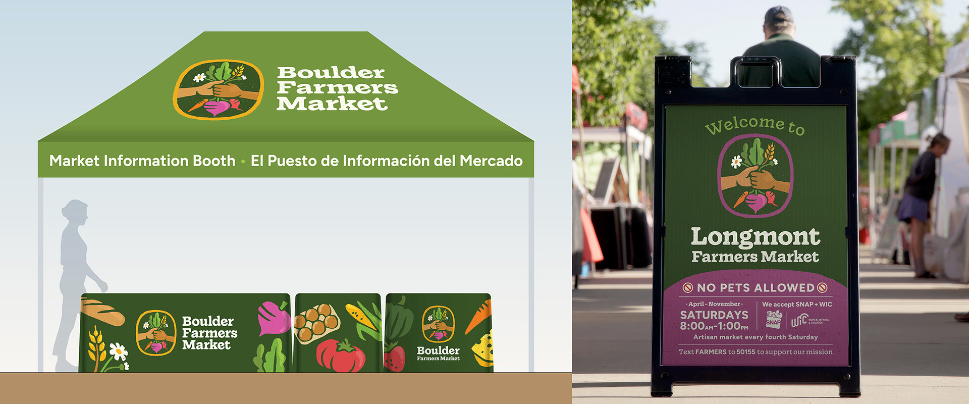


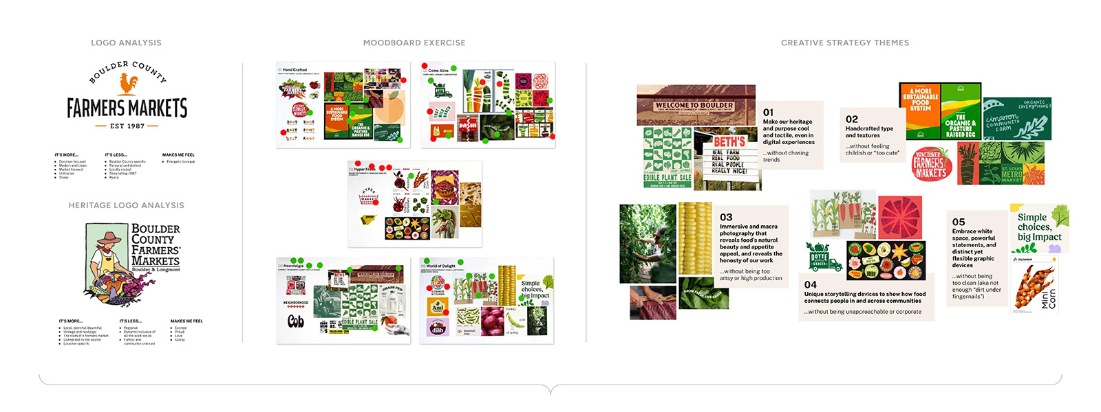
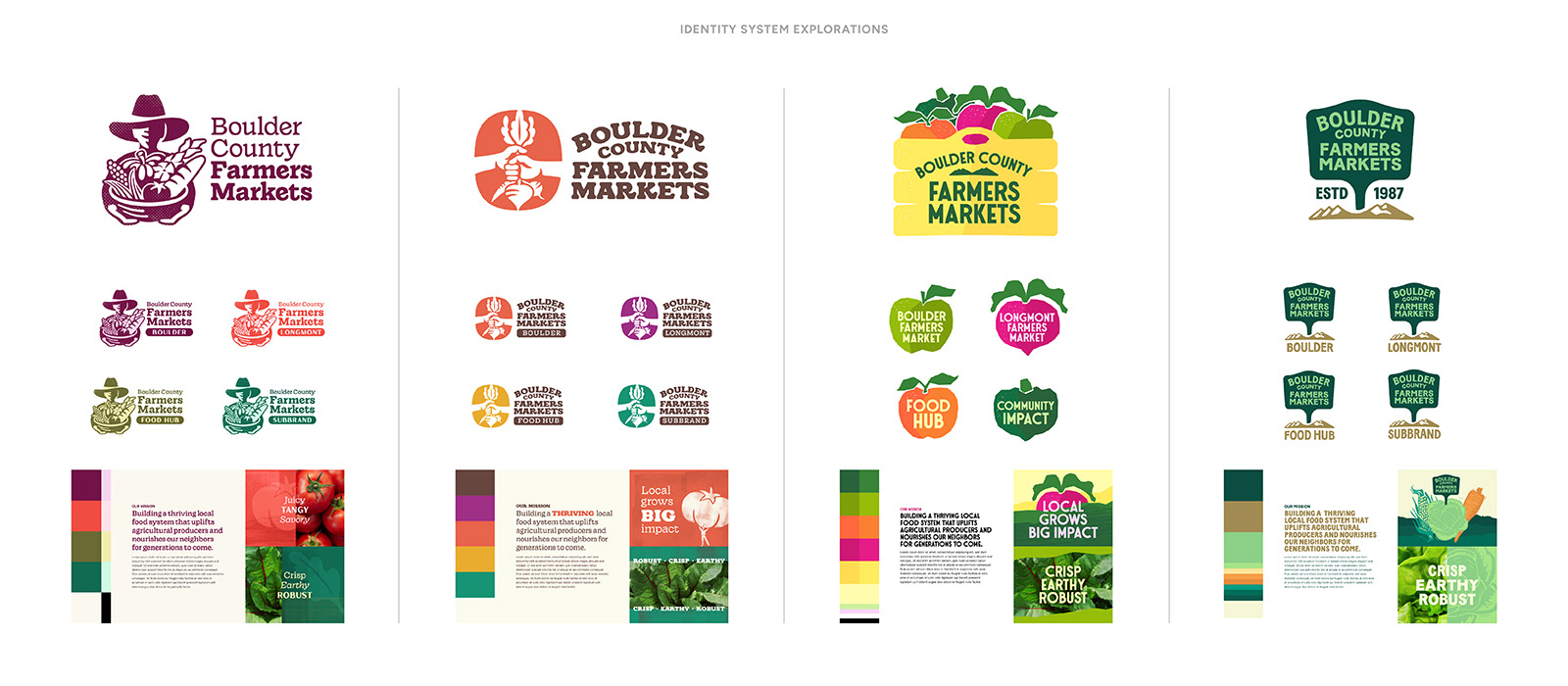
To arrive at a successful logo mark and brand family extension, creative strategic framework was crafted from client discovery, desk research, current & previous brand analysis, and in-person stakeholder exercises. Early identity system explorations investigated a range of strategic priorities: from heritage-honoring to freshly artistic to advocacy champions.
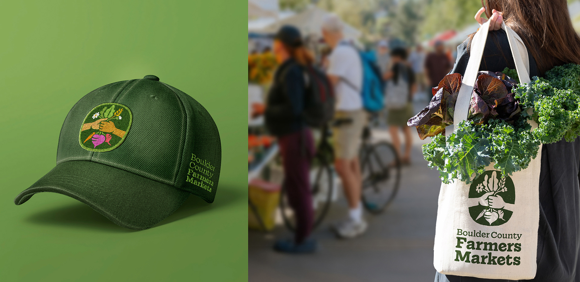
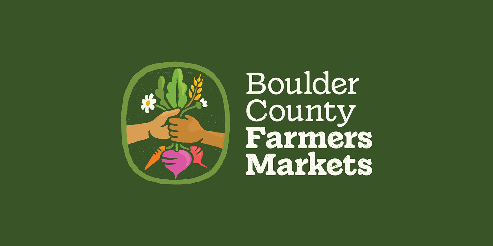
The selected logo mark direction unites growers & eaters in order to create the food system Boulder County deserves. The illustration shows two neighbors passing a bouquet of agricultural goods from the hand of the producer to the consumer—it's moment of connection that sparks a bright future for both sides.

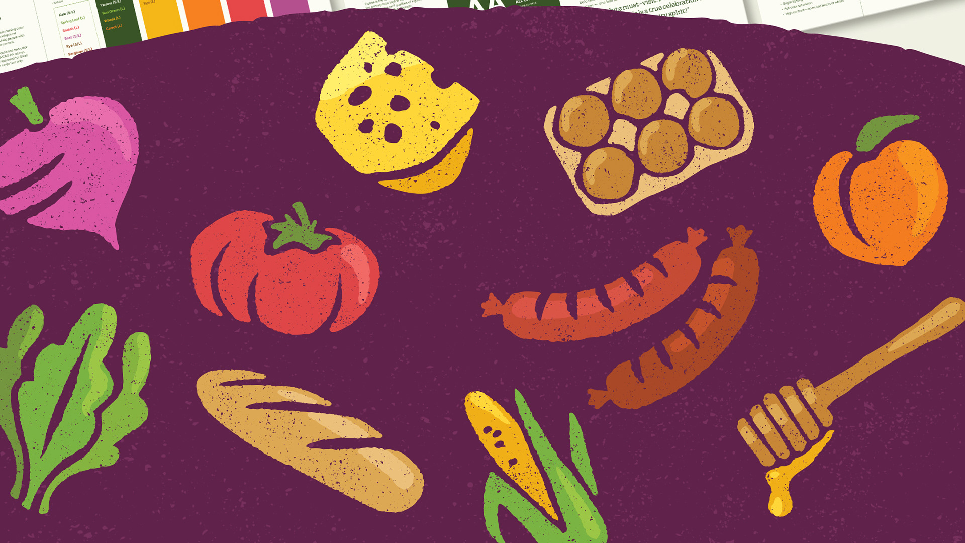
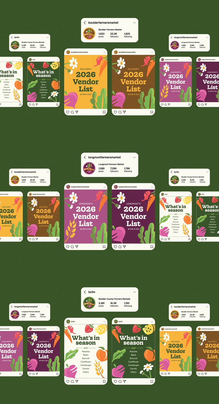
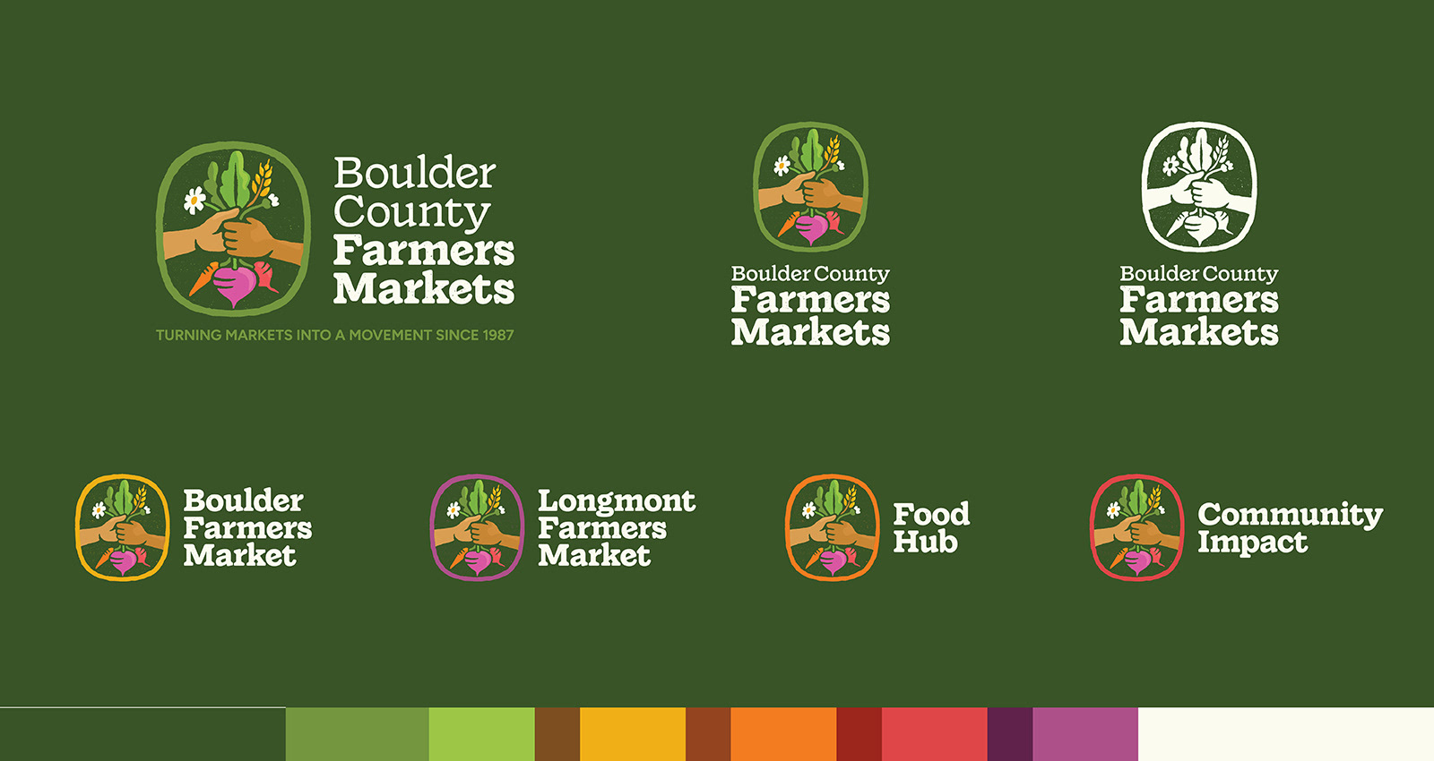
Icon refinement resulted in a down-to-earth illustration style and an abundant color palette to reflect the weekly market experience. Extension into the brand family anchored around the icon with color cues to signal related, but distinct subbrands.