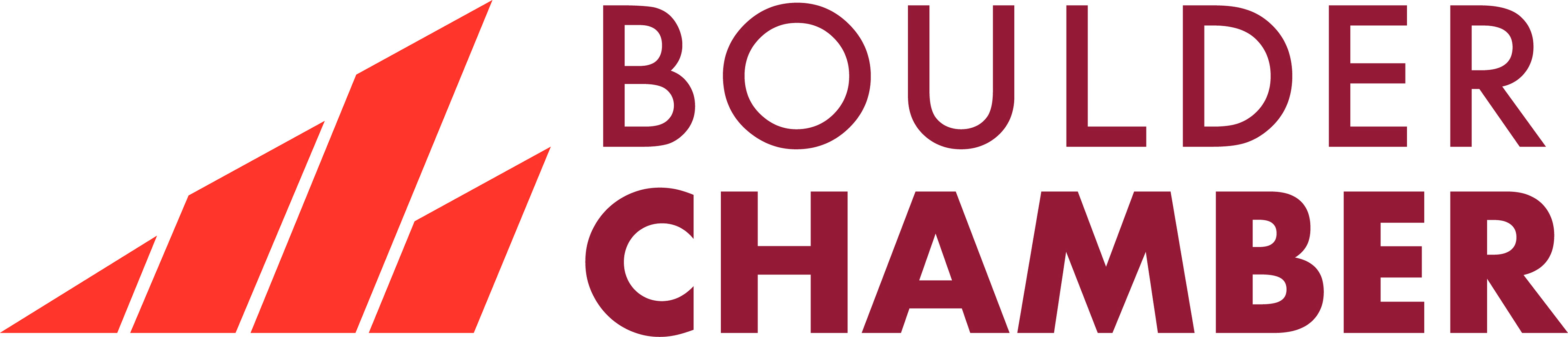
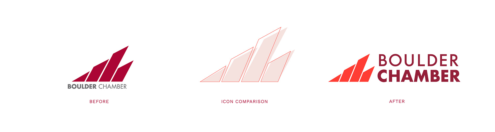
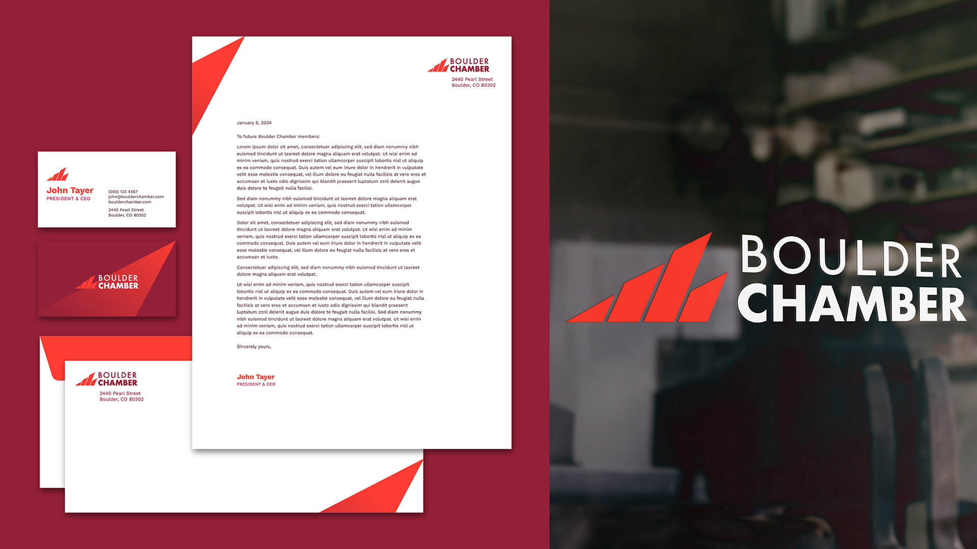
Logo Evolution
The evolved logo retained brand equity from the previous mark (its mountain icon, maroon red color, and brand font) while: 1. improving the wordmark legibility, 2. emphasizing "Chamber" as the key name differentiator, 3. softening the mountain icon's over-assertive slant, and 4. infusing new vitality with a brighter, bolder red.
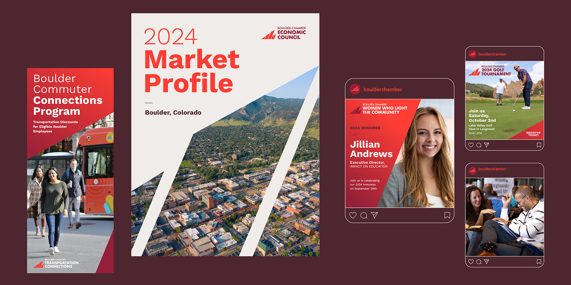
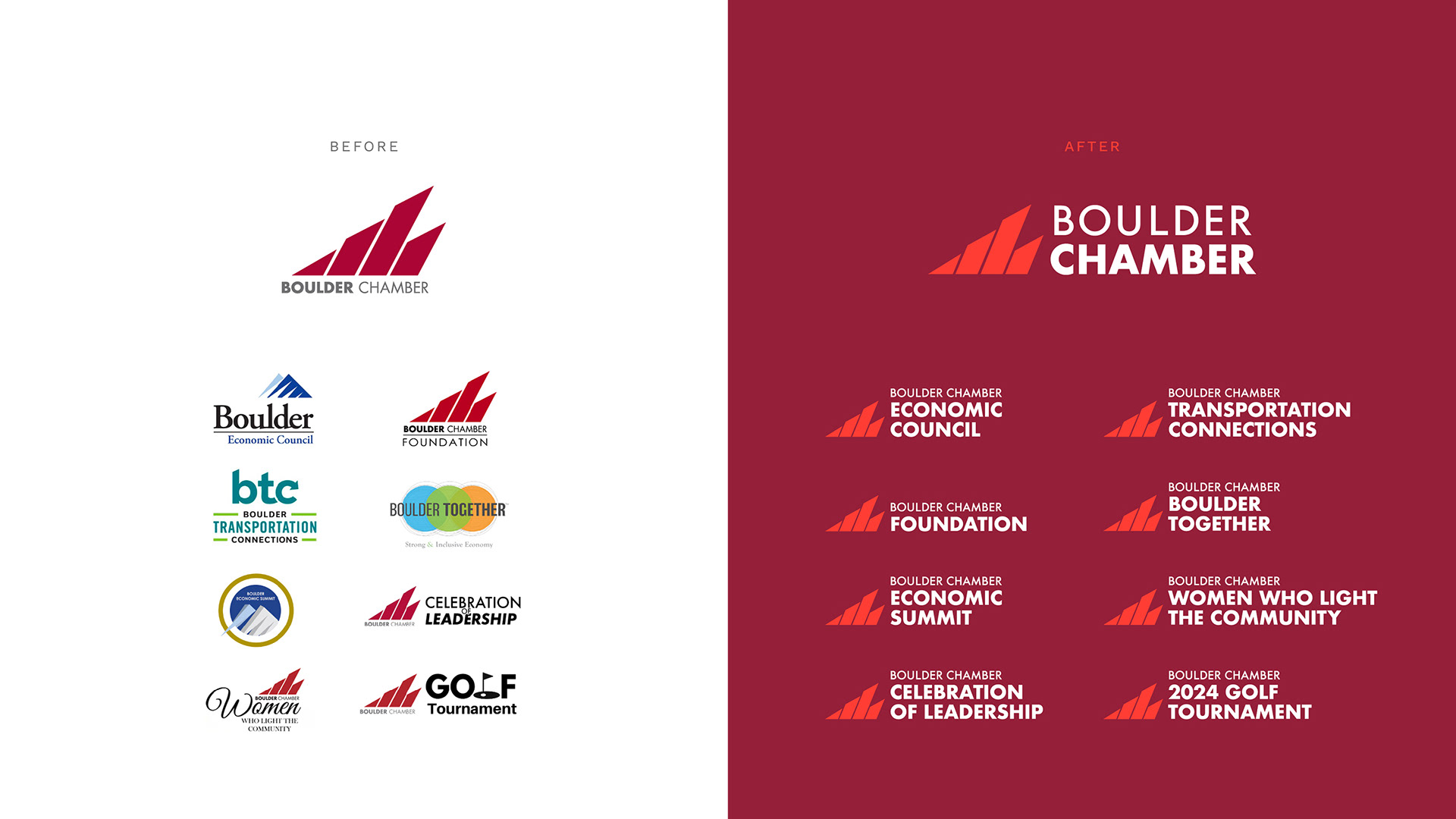
BRAND ARCHITECTURE
In the new branded house architecture, the impact of the Chamber's numerous offerings was strengthened by retaining the iconic mountain icon and brand font across all entities:
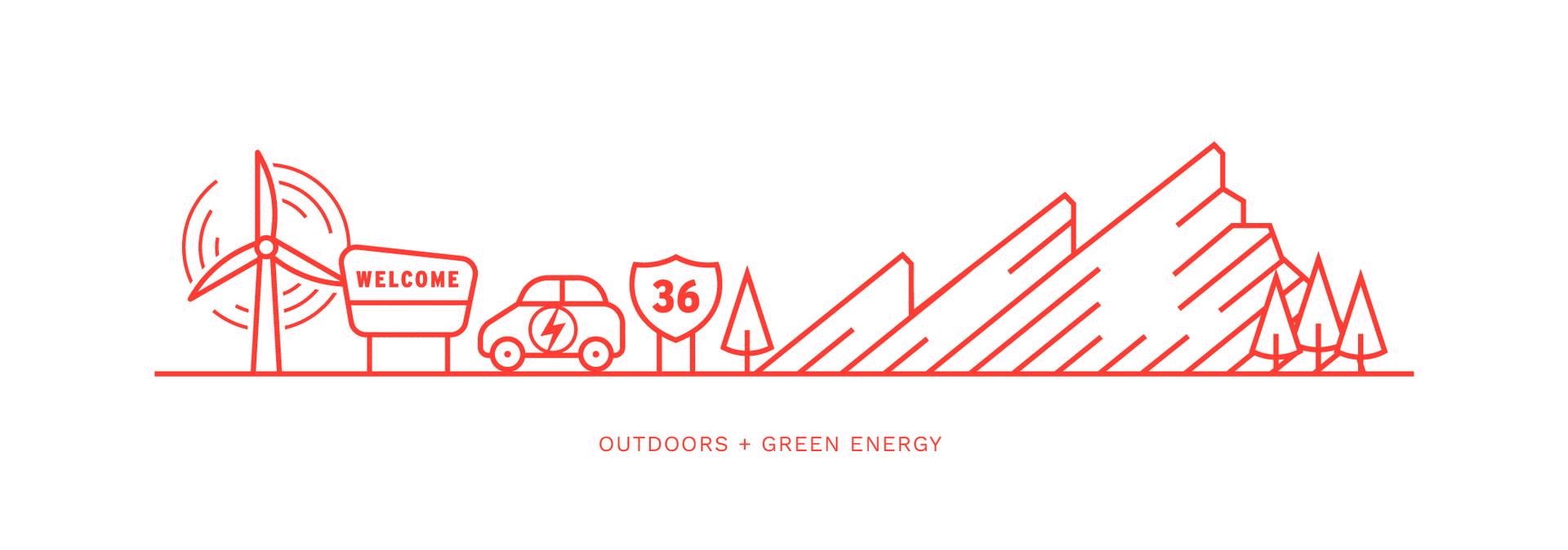
Boulder Skyline Illustration
To visualize the Chamber's involvement & impact in Boulder, I created a skyline illustration to be both placemaking, as well as demonstrative of their commitment to a breadth of business sectors. The illustration is composed of four scenes that can be used individually, as well as in a singular lockup. Each individual illustration is representative of particular industries, services, and characteristics: Outdoors + Green Energy; Small Business, Arts + Walkability; Technology, Health + Sciences; Food & Bev + Transportation Services.